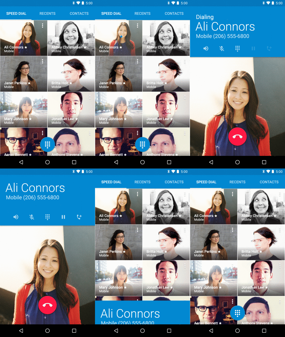
Material design: tactile surfaces, bold graphic design, fluid motion
When you think about mobile, an important aspect is the feel of the devices in your hand. Because of this, touch is one of the primary elements of material design, which is inspired by real life materials like paper and ink.
With material design we also based our work on the foundations of good graphic design, using strong colors and bold typography to create clear hierarchy and focus attention on content.
Motion brings the material and the graphic together, explaining how the system works, and adding moments of delight that move you through the system, easily and fluidly.
Extending material design throughout the apps you love
A number of apps that you know and love have been working hard to build material design into their framework. It is important that every app be able to take on its own unique personality and experience while fitting in the larger system. A few of our favorites are launching updates shortly:
 |
| The Wall Street Journal, Tumblr and BuzzFeed with material design. |
Bringing the design conversation to you
While we first introduced material design this summer, today’s updates are just the beginning of delivering a modern design language for the next wave of devices in your life. It’s a conversation we’d like to keep going. Starting tomorrow, we’ll be gathering some of the best design thinkers from around the industry at FORM, a cultural event for wide-angle design conversation. And we’ll be continuing the conversation with you online, on Google+ and Twitter and at google.com/design. We look forward to working with you to help push the limits on what’s possible through design.
Posted by Nicholas Jitkoff, Designer
 10.02
10.02


![[FREE ANDROID APP] Drippler - Personalized Android Tips, Apps and Games](https://blogger.googleusercontent.com/img/b/R29vZ2xl/AVvXsEiiqAPyT7mr8CKJXgYU2pBkEQGwj88A1sofJ89Nxw6YuH9FKA6wKB0bmnMr3xOKTOYTRihioJwd_Fpz_3fpMCdeGu2mwkMbapq8Qbhl_Y5C_eJf5mqkhiRWBNoNjiisezdDsjcAlvSpMd4/s72-c/Drippler+free+android+app+jilaxzone.png)

Tidak ada komentar
Posting Komentar